Plot regression lines between sets of rates
clockrate_reg_plot.RdDisplays a scatterplot and fits regression line of one set of clock rates against another, optionally displaying their Pearson correlation coefficient (r) and R-squared values (R^2).
Arguments
- rate_table
A table of clock rates, such as from the output of
get_clockrate_table_MrBayes.- clock_x, clock_y
The clock rates that should go on the x- and y-axes, respectively.
- method
The method (function) used fit the regression of one clock on the other. Check the
methodargument in the togeom_smoothfunction of ggplot2 for all options. Default is"lm"for a linear regression model."glm"and"loess"are alternative options.- show_lm
Whether to display the Pearson correlation coefficient (r) and R-squared values (R^2) between two sets of clock rates.
- ...
Other arguments passed to
geom_smooth.
Details
clockrate_reg_plot() can only be used when multiple clocks are present in the clock rate table. Unlike clockrate_summary and clockrate_dens_plot, no "clade" column is required.
Examples
# See vignette("rates-selection") for how to use this
# function as part of an analysis pipeline
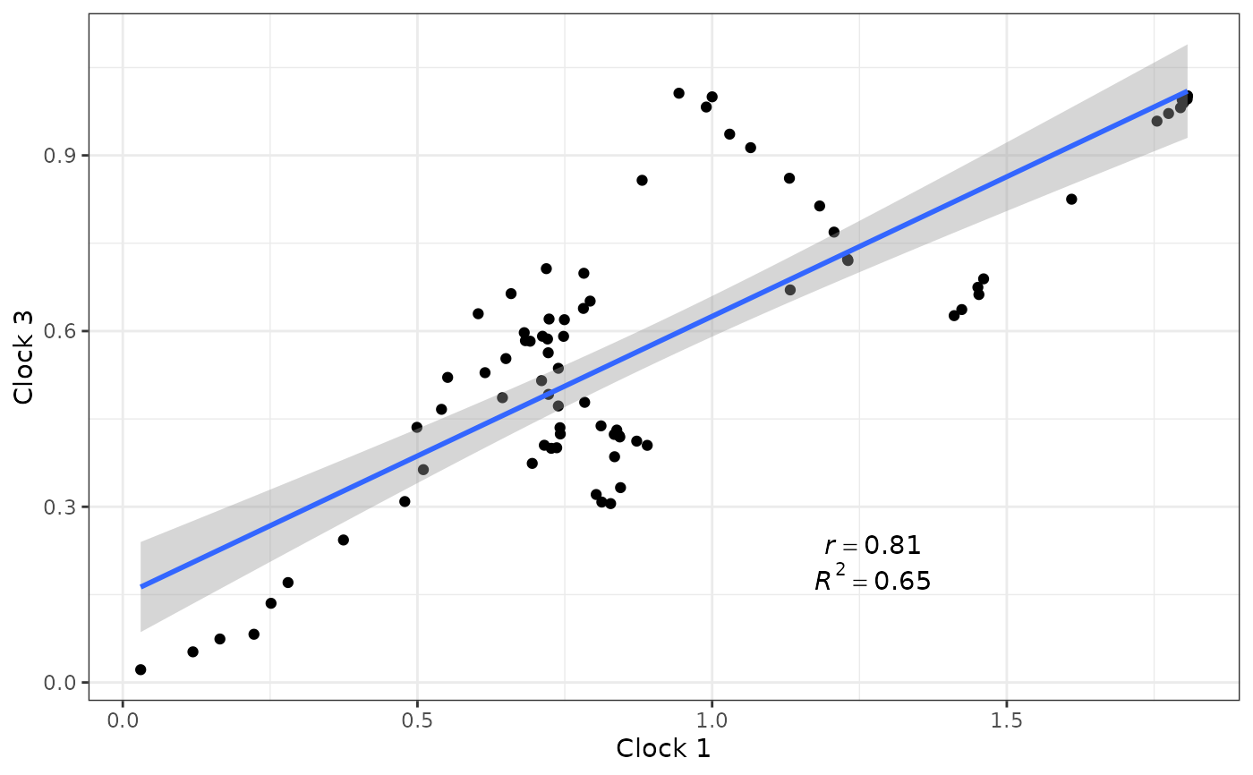
data("RateTable_Means_3p_Clades")
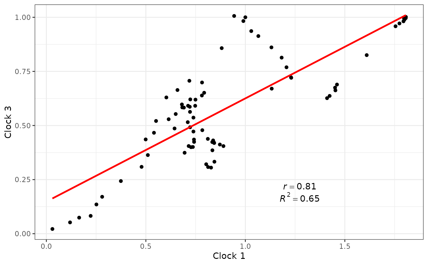
#Plot correlations between clocks 1 and 3
clockrate_reg_plot(RateTable_Means_3p_Clades,
clock_x = 1, clock_y = 3)
 #Use arguments supplied to geom_smooth():
clockrate_reg_plot(RateTable_Means_3p_Clades,
clock_x = 1, clock_y = 3,
color = "red", se = FALSE)
#Use arguments supplied to geom_smooth():
clockrate_reg_plot(RateTable_Means_3p_Clades,
clock_x = 1, clock_y = 3,
color = "red", se = FALSE)